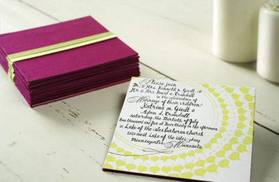
You know what it's like to get a wedding invitation in the mail. You don't even have to open it to know what it is. If the heft of the swanky envelope didn't give it away then the calligraphy did for sure. So you tear open the envelope with extra care and pull out . . . a second envelope. Round two leads you to a stack of ecru cardstock and vellum wrapped in a contrasting paper band, or maybe a brightly colored pocket fold enclosure, or perhaps one of those accordion fold invites. The couple went with letterpress instead of engraving, you notice. But all the usual suspects are otherwise in place. There's the main invitation, the two names in a swirly script standing out against all the proper small caps. Reception card, travel info, RSVP with stamped envelope, all present and perfectly coordinated. Props to the couple, you think. But you got the save-the-date months ago, you've been to their website to get the travel info, your hotel is even booked already, and they know you'll be there. With bells on, as the RSVP indicates. Oh well, they're still lovely.
Truly, I love wedding invitations. I get all geeked out over the designs and the pretty colors. I do take note when a couple goes out of their way to follow all the highest etiquette rules. But the problem with tradition is that so many invitations end up looking the same! At least, they seem a little too standard for the wedding we're planning. As I gather inspiration for my own invites I'm mostly drawn to those that just look different. My current favorites from Mr. Boddington's Studio:
My cousin is helping us with the artistic side of ours, which totally rocks. I'll save those details till everything's done, but I know that part will be fantastic. In the meantime, I've spent the last couple of days wading through fonts. Thousands of fonts. I want something that splits the line between polished and familiar, something with a lot of personality. Here are some of my current favorites:
{Petras Script}![]()
{Licorice}![]()
{Satisfaction}![]()
{Bayern Handschrift}![]()
{Affable}
And I think I've narrowed it down to 16. Any votes?
3.16.2009
Invites
at
6:44 PM
![]()
Subscribe to:
Post Comments (Atom)


2 comments:
They all look great. If I had to vote, I'd say either the Licorice or the Bayern Handschrift.
How is your dress coming along?
I like the Petras Script and the Satisfaction. They both are very unique looking.
Post a Comment